
Grindr

CHALLENGE
Acknowledging the user demand for a video chat feature, design a video chat experience that is seamlessly incorporated into its current mobile app experience.
SOLUTION
Research current video features and augmented reality to design a video chat feature that is seamlessly incorporated into its current mobile app while meeting the needs of users.
result
Due to our user research, we expanded our scope which resulted in the development of video chat and verification features to increase user satisfaction by reducing bots and cat-fishing.
Project details

ABOUT GRINDR
Since launching in 2009, Grindr has grown into the largest social networking app for gay, bi, trans, and queer people. They have millions of daily users who use their location-based technology in almost every country in every corner of the planet.
My Role
As a UX designer I conducted research, interviews, usability testing, and created the journey map, sketches and designed wireframes and hi-fidelity mockups.
Tools
Sketch app, Whimsical, InVision, white board, post-its, pen and paper
overview

Research
Social Research
We created 3 user profiles to understand how the app is used and see it from our users point of view. We also researched and spoke to people in the community to better understand how they navigate their environment.
Industry research
We researched video chat features and augmented reality in other apps to find the best possible solutions.
user interviews
We conducted 9 thirty-minute user interviews to understand our users needs and frustrations.
C & C analsysis

We conducted a competitive and comparative analysis on multiple dating apps our users interacted with. We compared features from Tinder, Scruff and Jack’d.
BROADENING OUR SCOPE
Moving forward we realized more important issues that needed to be addressed. Our users expressed frustrations with message/app reliability, cat-fishing, unwanted content and too many bots. This shifted our problem statement to include the following:
In addition to adding a video chat feature, how can we eliminate or reduce the amount of cat-fishing and bots within the app to produce a more pleasant experience for our users?
synthesize
AFFINITY MAPPING
We gathered information from our interviews that solidified our pivot in our research. The trends showed that users were less concerned about the video chat and more concerned with the bots and cat-fishing. However we found that the video chat feature served not only the demand but the reduction of cat-fishing as well.
user persona
We created our friend Leon, 24, who is based out of San Francisco to understand who Grindr is for. We referenced him throughout the process to keep our design decisions focused on our user.
journey map
We created a journey map for Leon, as a visual representation, to understand our users experience with Grindr. We found that when Leon wanted to connect with someone nearby he experienced frustrations with message dependability, unwanted content, and bots resulting in him ultimately getting cat-fished.
FEATURE PRIORITIZATION
Because there were a lot of suggestions for features that could be added we created a feature prioritization. Once created, we were able to clearly narrow our focus on account verification, live photo, and the video chat feature.
Ideate
Scenario
It’s Friday evening, and Leon just got off work. He is looking to connect with someone nearby; However, he remains hesitant after being cat-fished by another man on Grindr last week.
Design Studio
Keeping our scenario in mind, we began quick sessions of design studio to generate our ideas. After a group critique we put together our best ideas in our final sketches before testing.


testing and iteration

usability tests
We conducted 15 usability tests with prototypes increasing in fidelity.
user Task
Access Grindr and help Leon verify his account. Now find him someone who is online to start a chat and authenticate his identity. Let’s hope this is the one!
OUR FINDINGS
Users were unsure how to verify their account
Difficult to differentiate the photo stamp from the picture
Users wanted the ability to go through the app while still engaged with video chat
solution
account verification
After research and ideation we found the best solution was photo verification that asks you to take a selfie, copying the gesture provided. This is a fun but effective way to prevent cat-fishing and bots.


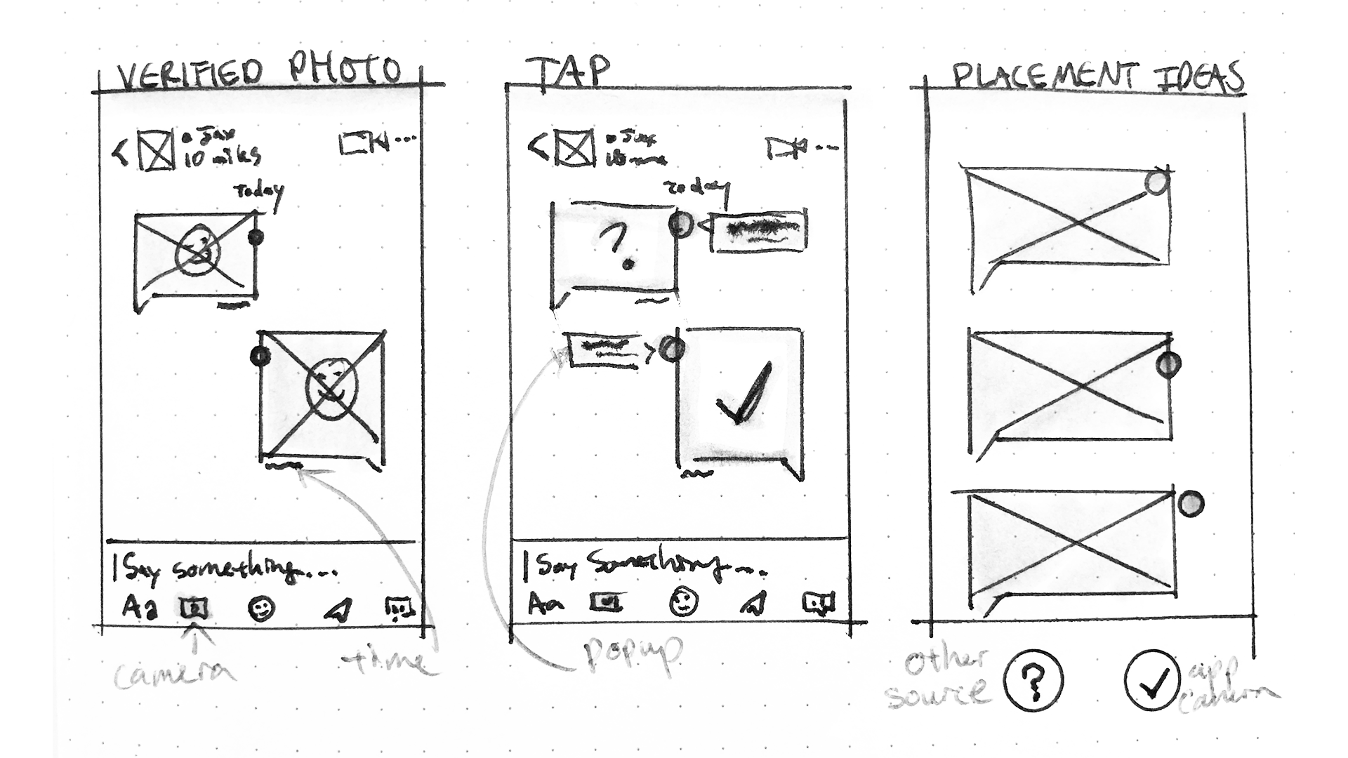
photo and video chat feature
Another feature to prevent from cat-fishing is a photo feature that tells the user whether or not a photo sent to you is taken right then and there with the apps camera.
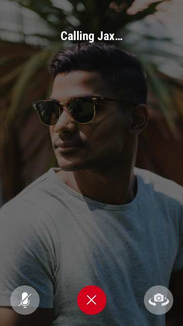
We then added a video chat feature to allow users to quickly connect. One important feature of this was that users are not allowed to video chat unless you get a reply. We also provided the option to pause the video when using the app.


Final prototype
task
Access Grindr and help Leon verify his account. Now find him someone who is online to start a chat and authenticate his identity. Let’s hope this is the one!
RESULT
With verifying your account in a few simple steps, users, like Leon can stay clear of bots and be certain of who they are talking to.
We added a photo feature to tell if the picture was taken with the apps camera to reduce cat-fishing.
Finally we added the new video chat feature, allowing access once a reply was received, to give users more control to find real connections while limiting unwanted content.
To view prototype, click the play button above
in retrospect

Next steps
We wanted to test the location of the users profile. We created a new browse page (in the image shown to the left) with the profile placed in the bottom right corner instead of having it placed in the ‘whose nearby’ section. Although it wasn’t a concern with our current users, new users found the layout confusing and odd.
We also would consider changing a few design elements
Size and placement of text
Filter options and access
To learn more about the project, contact me at paigebennett.ux@gmail.com